Daftar Isi
In the ever-evolving landscape of digital music streaming, Spotify has been a trailblazer since its inception. Beyond its vast music library and personalized playlists, Spotify’s user interface (UI) has undergone a fascinating journey. From its early days to the present, the UI has shaped how millions of users interact with music. In this article, we’ll explore Spotify’s user interface evolution, dissecting its design choices, innovations, and the impact on user experience.
The Green Beginnings: Simplicity and Functionality

When Spotify emerged onto the music scene back in 2008, it revolutionized the way we consume music, offering a legal, subscription-based streaming service that would forever change the landscape of the music industry. At its core was a sleek and intuitive user interface (UI) that set the standard for modern music streaming platforms. Let’s delve into the defining features of Spotify’s early user interface and how they shaped the user experience:
Embracing the Dark User Interface
Right from its inception, Spotify made a bold design choice by embracing a dark interface—a departure from the conventional light-themed music players of the time. The sleek black background not only exuded sophistication but also served a functional purpose. By providing a stark contrast to album covers and track listings, the dark interface allowed visual elements to pop, creating a visually captivating and immersive experience for users.
Central to Spotify’s early user interface was its intuitive tab-based navigation system, which provided users with easy access to various sections of the platform. Tabs such as “Browse,” “Radio,” and “Your Library” were strategically positioned to organize content logically, allowing users to seamlessly navigate between playlists, discover new music, and manage their saved tracks. This streamlined approach to navigation ensured that users could effortlessly find and enjoy their favorite tunes without any hassle.
Spotlight on Search
At the heart of Spotify’s user interface was its robust search functionality, which took center stage on the platform. The prominently placed search bar underscored Spotify’s commitment to helping users discover music tailored to their preferences. Whether users were looking for a specific artist, album, or track, the intuitive search feature made it easy to find and access their favorite tunes with just a few keystrokes, reinforcing Spotify’s reputation as a user-centric platform.
In essence, Spotify’s early user interface epitomized simplicity, functionality, and elegance, setting the stage for the platform’s meteoric rise to prominence in the music streaming industry. By embracing a dark interface, implementing intuitive tab-based navigation, and prioritizing search functionality, Spotify redefined the music listening experience, paving the way for a new era of digital music consumption. As Spotify continues to innovate and evolve, its commitment to delivering an exceptional user experience remains unwavering, ensuring that music lovers around the world can enjoy their favorite tunes with ease and convenience.
Read More: Behind the Spotify Algorithm: How Spotify Curates Your Perfect Playlist
Iterations and Innovations: A Dynamic Mobile Interface
As Spotify grew, so did its user interface. Here are key milestones in its evolution:
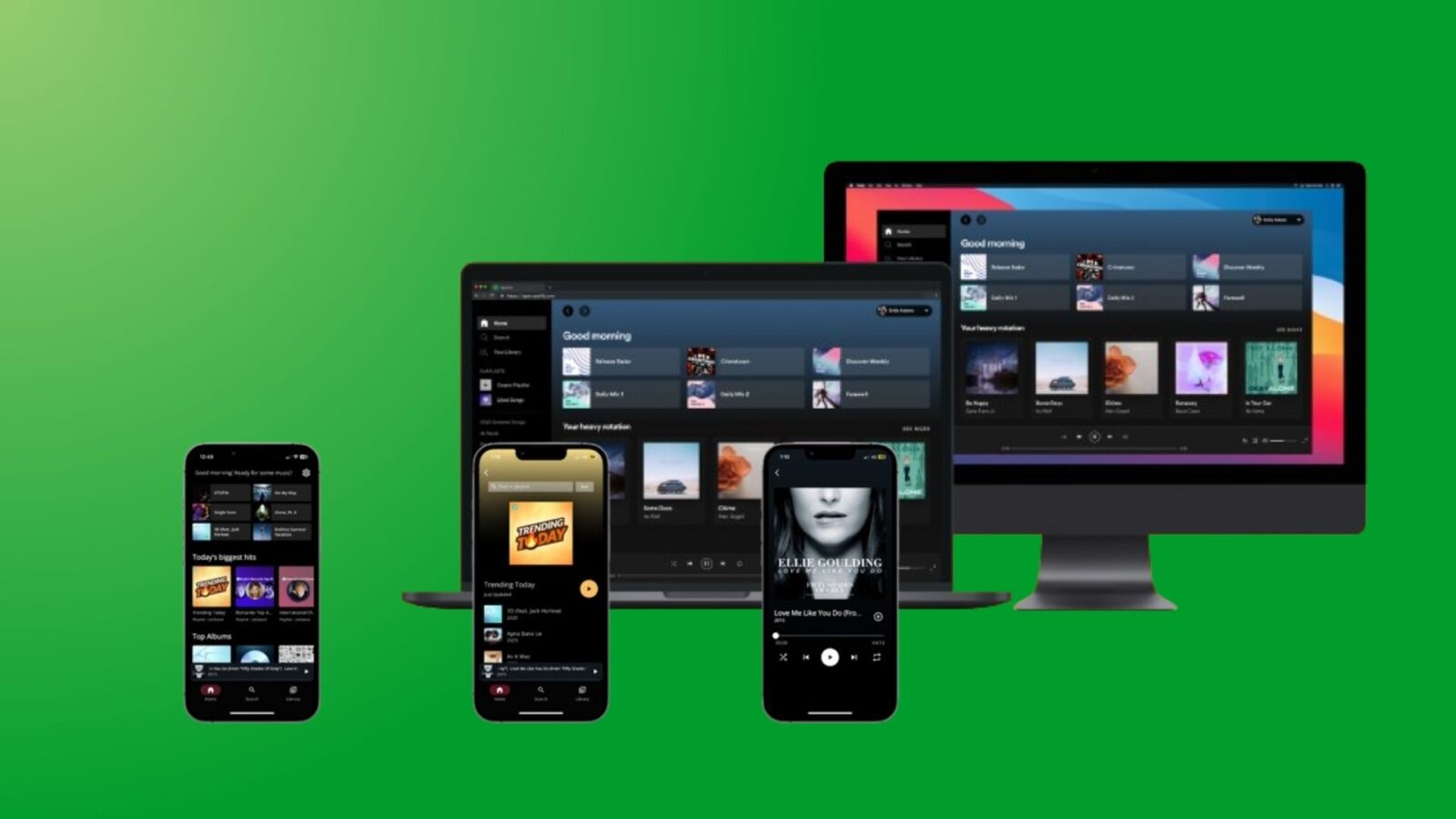
- Responsive Design: Spotify adapted its user interface for various devices, ensuring a consistent experience across desktop, web, and mobile. The mobile app, in particular, became a powerhouse, allowing users to stream music on the go.
- Personalization: Spotify’s UI became smarter. Algorithms analyzed listening habits, serving up personalized playlists like “Discover Weekly” and “Release Radar.” The UI seamlessly integrated these recommendations.
- Dynamic Home Page: In 2023, Spotify unveiled its biggest UI overhaul yet. The new home page features scrollable clips and previews, encouraging deeper exploration. It’s all about discovery and connection1.
- Icon Refresh: Even the smallest details matter. Spotify’s design systems team recently refreshed its icons, maintaining familiarity while adding a touch of modernity2.
Conclusion
Spotify’s UI journey mirrors its mission: to unlock the potential of human creativity. As Spotify continues to innovate, its UI will remain a canvas for music lovers worldwide. So next time you queue up a playlist, appreciate the thoughtfulness behind those buttons and album art grids.


